Western Eyecare - Corporate Identity
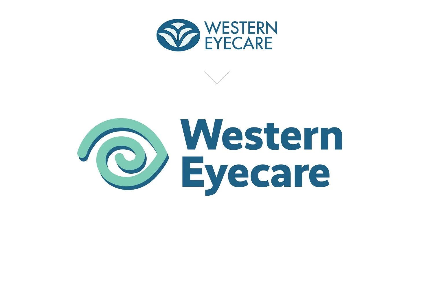
Western Eyecare have established themselves as a trusted Ophthalmic and Oculoplastic service catering for a vast range of Ophthalmic conditions. Originally they shared a strong visual connection to the Western Hospital by using the same logo emblem on their logo. In 2024, it was decided that Western Eyecare needed to establish their own unique brand identity. We were asked to give the logo and corporate stationery and communications a visual brand refresh. Combining elements of the old colour palette with a fresh new brighter colour we were able to maintain some connection to the established brand while giving it a completely fresh modern feel. The new company emblem was developed to reflect the distinctive shape of an eye, eyelid and brow whilst also incorporating the letter ‘e’ for eyecare. Careful consideration was given to ensuring the new colour palette and typefaces matched the existing website - negating the need to totally redesign the website to suit. A simple, yet significant visual brand refresh!
Primary Portrait Logo with Tagline
Logo Signage & Wallpaper Concept
Western Eyecare Corporate ID - Before & After
Western Eyecare Appointment Cards


